This assignment asked us to find and critique two maps, an example of a well-designed map and one of a poorly-designed map, judged on the basis of Edward Tufte's list of map design principles detailing what makes a good and useful thematic map.
As my well-designed map, I chose this one from the U.S. Census Bureau:

This map does a
good job of clearly and concisely presenting the largest ancestry group in each
county of the U.S., both providing that information for individual counties and
visualizing regional patterns and variation. While there would surely be even
more variation at an even smaller scale (such as census tract), using the
county-level data brings out patterns that are hidden by state-level data
without making the map so packed with information that it’s hard to see what’s
happening. It follows Map Principle 2, “complex ideas communicated with
clarity, precision, and efficiency;” it’s clear at a glance what the map is
showing, and there is no ambiguity or unnecessary information. It also follows
Map Principles 7 and 8 about clear and thorough labeling, by providing a
prominent legend identifying the significance of each color displayed as well
as a list of what’s included in the “Other” category. A few aesthetic aspects
of this map that particularly appeal to me are its simplicity (there’s a lot of
information presented because the map covers a large area, but it’s only two
kinds of information, county outline and biggest ancestry group), its visual
appeal (colors are readily distinguished from one another but none of them are
blindingly bright or clashing with what’s around them), and the use of the
ancestry by state inset map, which I think adds
context and emphasizes the amount of variation at the county level.
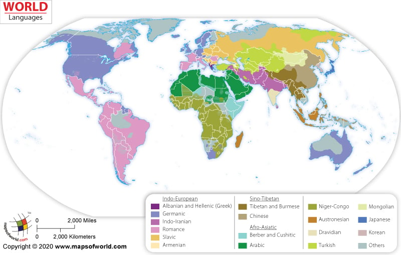
As an example of a poorly designed map, I chose this one from mapsofworld.com:
The biggest problem with this map is that it supposedly shows
countries according to language, but doesn’t explain what this categorization
signifies. Are they mapping the majority language? The official language?
Something else? Since many countries have multiple languages spoken within
their borders, it’s important to be specific about what this map illustrates. While
the layout and overall design of the map isn’t terrible, it’s hard to get any
significant information out of it, which is a big problem. These issues are in
violation of map principles 2 & 3, about clearly and efficiently mapping
big or complex ideas, and possibly Principle 5, which “requires telling the
truth about the data,” instead leaving the viewer with questions or assumptions
about what the data actually mean. I would suggest improving this map by
providing a clearer explanation (even a more specific title could potentially
accomplish this) of what information is being presented, explaining or
eliminating the inconsistencies in categorizing that information (e.g., what
distinguishes countries labeled “multi-lingual” from those that have been
assigned an individual language despite having multiple languages spoken by
their populations, and why are some countries simply labeled “other”?), and being
more careful with color choices to avoid confusion between very similar colors
that mean different things.
No comments:
Post a Comment