Thursday, January 26, 2017

Cartographic Skills Module 2: Intro to Adobe Illustrator

This week's lab was all about getting acquainted with Adobe Illustrator and how it can be used to put finishing touches on maps created in GIS and edit map layouts. I've only ever exported/printed maps directly from GIS, so this was a new experience. Figuring out how to use Illustrator has been challenging, but there's so much you can do with it!

Below is my finished map. The base map was created in ArcGIS from data provided, and I used Adobe Illustrator to adjust the colors, as well as the transparency of the water features so that county boundaries are visible underneath, to change the city symbols (using a find/replace script also provided for the class), to label some of the cities, to edit the legend, to resize the map (along with its scale bar, of course!), and finally to add images, various text elements, and a background color and to finalize the layout. 

Monday, January 23, 2017

GIS Week 2: "Own Your Map" Lab

Below is the map that resulted from this week's lab focused on map design in ArcGIS. This lab was a much more thorough treatment of how to customize map elements and overall layout than I got from previous GIS courses. The actual assignment here involved a map showing the location of UWF's main campus within Escambia County, FL, along with an inset map highlighting Escambia County's location within the state. (As an online student who's never set foot in Florida, I didn't even realize until now that UWF is almost all the way in the northwest corner of the state!) Nearby towns and interstates are also presented for additional context about UWF's location, which is indicated by the circled star to make it stand out. 

Wednesday, January 18, 2017

Cartographic Skills Module 1: Map Critique

This assignment asked us to find and critique two maps, an example of a well-designed map and one of a poorly-designed map, judged on the basis of Edward Tufte's list of map design principles detailing what makes a good and useful thematic map.

As my well-designed map, I chose this one from the U.S. Census Bureau:


This map does a good job of clearly and concisely presenting the largest ancestry group in each county of the U.S., both providing that information for individual counties and visualizing regional patterns and variation. While there would surely be even more variation at an even smaller scale (such as census tract), using the county-level data brings out patterns that are hidden by state-level data without making the map so packed with information that it’s hard to see what’s happening. It follows Map Principle 2, “complex ideas communicated with clarity, precision, and efficiency;” it’s clear at a glance what the map is showing, and there is no ambiguity or unnecessary information. It also follows Map Principles 7 and 8 about clear and thorough labeling, by providing a prominent legend identifying the significance of each color displayed as well as a list of what’s included in the “Other” category. A few aesthetic aspects of this map that particularly appeal to me are its simplicity (there’s a lot of information presented because the map covers a large area, but it’s only two kinds of information, county outline and biggest ancestry group), its visual appeal (colors are readily distinguished from one another but none of them are blindingly bright or clashing with what’s around them), and the use of the ancestry by state inset map, which I think adds context and emphasizes the amount of variation at the county level.

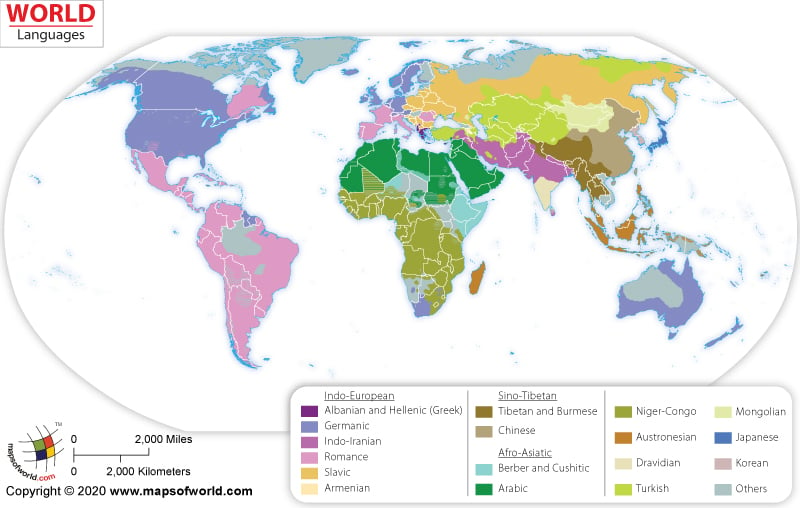
As an example of a poorly designed map, I chose this one from mapsofworld.com:


The biggest problem with this map is that it supposedly shows countries according to language, but doesn’t explain what this categorization signifies. Are they mapping the majority language? The official language? Something else? Since many countries have multiple languages spoken within their borders, it’s important to be specific about what this map illustrates. While the layout and overall design of the map isn’t terrible, it’s hard to get any significant information out of it, which is a big problem. These issues are in violation of map principles 2 & 3, about clearly and efficiently mapping big or complex ideas, and possibly Principle 5, which “requires telling the truth about the data,” instead leaving the viewer with questions or assumptions about what the data actually mean. I would suggest improving this map by providing a clearer explanation (even a more specific title could potentially accomplish this) of what information is being presented, explaining or eliminating the inconsistencies in categorizing that information (e.g., what distinguishes countries labeled “multi-lingual” from those that have been assigned an individual language despite having multiple languages spoken by their populations, and why are some countries simply labeled “other”?), and being more careful with color choices to avoid confusion between very similar colors that mean different things.

Saturday, January 14, 2017

Week 1: ArcGIS Overview Lab

The first GIS assignment in our introductory course was an easy one designed to familiarize the class with the basics of working with data in ArcGIS. This lab was basically a review for me, as I worked with ArcGIS as an undergrad, but it's nice to have a little refresher since I've been away from it for a few years now, and nice to know that I am starting to remember what I learned now that I've seen the program again! (I'm actually a little annoyed that we didn't go into changing the settings for the legend and breaking up the population data in a way that makes more sense, but I know for anyone seeing ArcMap for the first time this week, this was probably already an overload of information.)

In any case, here is the map I produced following the lab instructions, which shows the countries of the world according to their population sizes--the darker the color, the higher the population (as of 2007, the data we were using).


Friday, January 13, 2017

Week 1 Introduction

Hello Blogger!

My name is Erica. I'm an archaeologist originally from Bethlehem, PA and most recently from Virginia. I graduated from Oberlin College with a BA in Anthropology and have spent the past several years doing fieldwork full time. Now I'm taking a little break to pursue a GIS Certificate at University of West Florida, which will open doors to new opportunities both in and outside the field of archaeology. I hope to go on to a Master's degree in archaeology as well, but one thing at a time. I've done some GIS coursework in the past, but I'm excited to get back into it and learn more. I love maps, and I love the way new technologies are changing the way we analyze archaeological data.

Without further ado, here is the link to my first map assignment, an ESRI Story Map showing places I've lived: http://arcg.is/2jsNQhX.